HACO Wonen
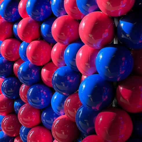
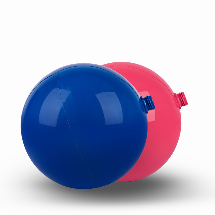
A new visual identity deserves a bold introduction. Haco Wonen & Slapen chose to say goodbye to their familiar colour scheme of green, yellow and black. In its place came a powerful and modern combination of deep blue and magenta. To make this rebranding clearly visible and easily recognisable across all their locations, Ball On was brought in. We delivered a striking visual campaign that not only communicated the change, but made it tangible for every visitor.
- Cost-effective
- Durable
- Attention-grabbing

New Page